
I ran into a great little service a few days ago that really helps bring company reporting to life, Hypercharts.
They track around 140 companies, many of which are in my portfolio or are things I’m looking at actively, and provide some really nice high level reporting and trending on key earnings metrics.
My strategic investing approach focuses more on the long term potential of a company rather than its revenues, profit, or cost management today, but there’s no doubt that these are useful data points in understanding how the company is run, and how it stacks-up against its peers.
I noticed today that Amazon have recently announced a greater level of integration with MongoDB over their other database products, so this was a prompt to take a look at MDB again, using hypercharts to try to get a better sense of a few of their financial metrics.

They’ve had a fairly steady net loss over the last few years, with a substantial investment in research & development and in sales & marketing. I guess this is indicative of an early stage company that’s reinvesting in itself to improve its product and grow its market share. It’s also a reality of the Coronaconomy that every company needs to fight hard to maintain its revenues.

MongoDBs revenue growth year over year is at the low end, relative to a few similar infrastructure peers, and it’s also been decreasing over the last few years. This isn’t a great story for an early stage company.

They’re also currently trading at a mid-ranked revenue multiple of 16x sales.
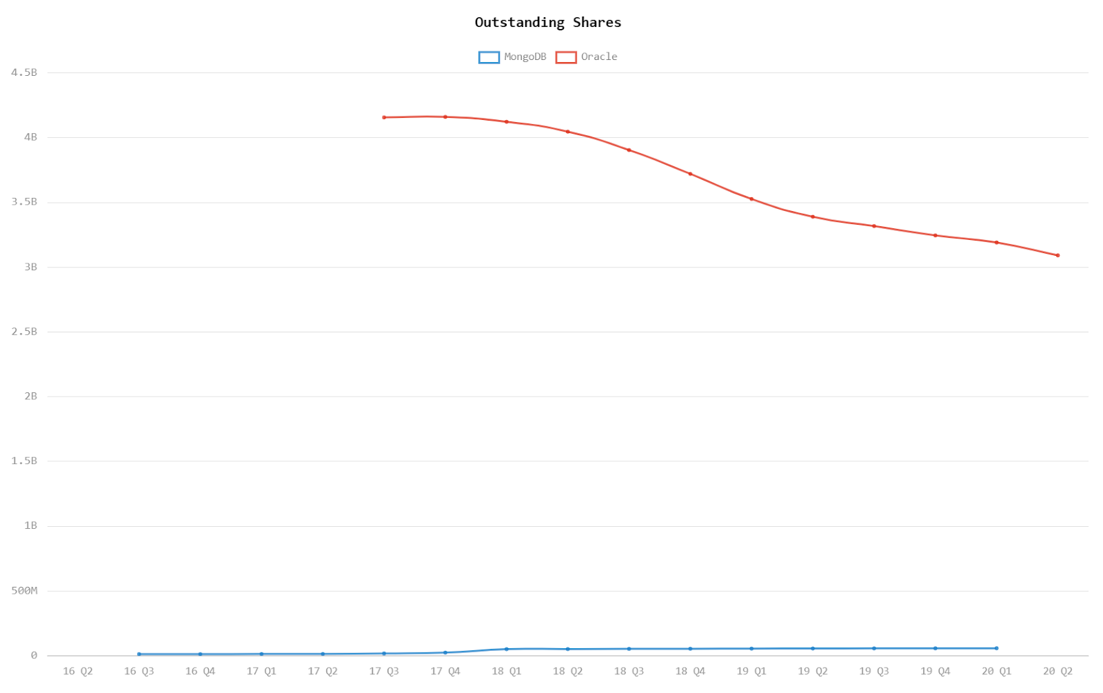
Looking at MDB within the context of its industry, it’s fairly interesting to compare them to the database behemoth, Oracle (handily, also covered by Hypercharts!)


As you’d expect for the David vs Oracle’s Goliath, MDB are growing at a faster rate (as we noted above), but it’s also interesting to note that Oracle’s revenues are decreasing – possibly simply a symptom of the current environment rather than indicating a material problem within the company. Oracle also has a much better handle on the operating expenses, and seem to be tightening their belts effectively in the last two quarters.
All in all, it seems to be a not entirely rosy picture for MongoDB. The only chart I did find that actually makes me a little more excited about them is the measure of outstanding shares compared to Oracle! I’ve always felt that a company that’s buying back its own stock has simply run out of other ideas for what they can do with their cash pile. You could throw this accusation at any number of huge companies, including several I’m invested in, but to me as a growth investor, it’s just not a good sign – and in this case, Oracle’s lack of innovation, may be MDB’s opportunity.